‘19-’21
Miami University’s brand was decades-old and disconnected.
Timeline: 2 yrs. (core team of 8-10)
Editorial Lead, UX Researcher and Designer: My role included creating the university’s Editorial Style Guide and content approval process, and consulting with the creative team to deliver the Miami University Brand Identity Guide. This project had (2) additional components: Still-Life Brand Imaging project (which I led) and the BrandBox research activity.
Rooted in its traditional “Public Ivy” reputation— it reinforced an elite image that alienated a younger generation of students.
The challenge: Create a contemporary brand that’s flexible, consistent, and easily identifiable. But one that balances protected tradition with social progress.

Measurable Impact
1
streamlined content approval process.
100
global brand alignment.
400
communicators trained.
50
ready-to-use content templates.
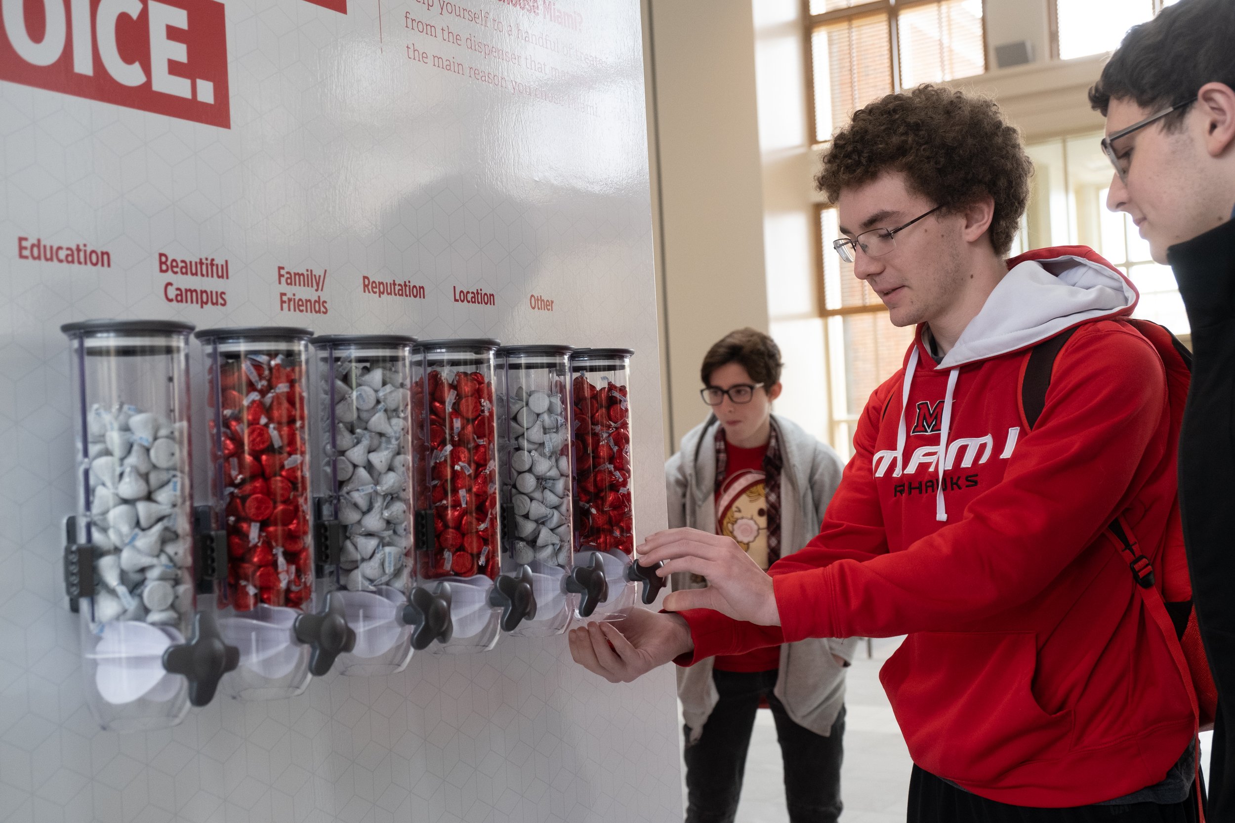
It all started by talking to real people in a creative and engaging way.
BrandBox transformed boring brand research into an interactive feedback hub at the heart of Miami. It took us (6) months to develop and activate.
The project complemented online surveys by gathering direct feedback from the campus community and sat as a 4-day pop-up in the Armstrong Student Center. Quick stats: 3,325 total responses, 98 sq. ft. of written memories and advice, and 727 sticky notes!
My role included brainstorming facilitation session, research and discovery, location scouting, messaging, prototyping and testing, and a strategic communications plan across internal channels and social.


Turns out, Miami's story needed to be visually told through modern, inspiring elements.
And communicated through crafted language that captured the spirit of its community. But really, we needed to tell Miami’s story from the experience of people actually engrained in its atmosphere rather than disconnected, aspirational messaging.
Our team identified core elements to focus on, which, when combined, empowered communicators to craft a complete and compelling narrative about the campus community.

Check out the refreshed brand components in the full guide.
-
Brand Architecture
Created a simple, consistent naming structure for departments, colleges, and divisions, and included restructuring current names and/or full titles.
-
Editorial Style
Standard for how Miami communicates to both internal and external audiences, with tailored guidance for unique relations, like the one between the University and the Miami Tribe of Oklahoma.
-
Standard Templates
Dozens of university-branded content templates created in-house and made available for limited use by authorized users.
-
Logo & Lockups
Corrected inconsistencies in the Beveled-M and used a contemporary yet traditional typeface: Freight Display Pro with slight modifications.
-
Color Palette
Chosen to reflect the red brick used in the iconic neo-Georgian architecture across campus, seen as one of the university’s aesthetic selling points.
-
Typefaces
Support brand messaging and values. Alternate digital typefaces were defined to maintain brand integrity across platforms with viewing and accessibility limitations.
-
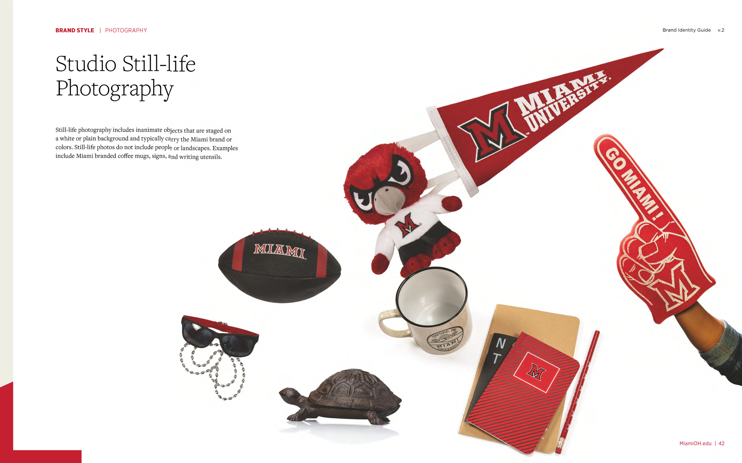
Still Life Photography
In-studio, still-life photography, and inanimate objects are arranged to add visual interest and impact to design layouts.
-
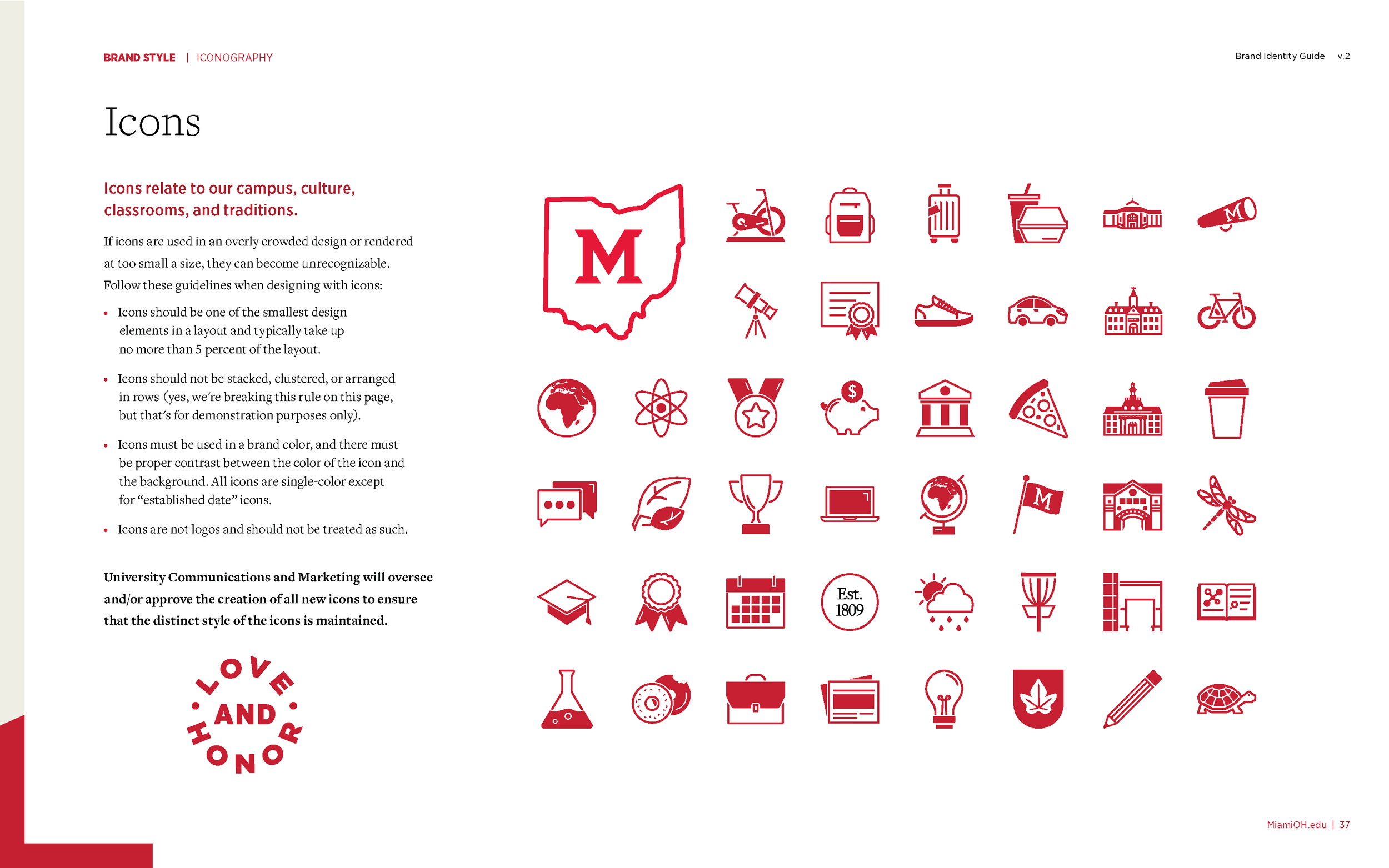
Badges and Icons
Visually simplified to support photography and text. Produced to be used as supporting elements related to campus, culture, and traditions.
-
Streamlined Approval Process
Canva for 400+ users with developed onboarding and training in brand content creation.